Presenting Superhero Sections
What is a Website Hero
A hero image is universally defined as “a large banner image, prominently placed on a web page, generally under the navigation and above the fold.” The Hibu hero image is static and typically covers the web page’s full width.
A hero image serves several purposes on a website:
- Its most important benefit is that it immediately engages a visitor’s attention.
- Since people respond positively to visual content, having an eye-catching image, a headline, motivating factors, and a strong call-to-action (CTA) may compel the visitor to stay on the page to learn more and help boost conversion rates.
The right hero should set expectations for the page visitor:
- Immediately communicating what they can find and/or do on that page.
- Some pages are intended for marketing or “selling” the business’ products and services, while other “utility” pages exist to help visitors accomplish a task – check the business hours, look at a menu, get a coupon, etc.
Two types of website pages: Core Pages (pages that sell) and Utility Pages.
Utility Pages are very specific to a task. Examples include About, Review, Gallery, Request Appointment, About, etc.
- Ideally, we want the user to get the information as quickly as possible because they’re on that page for a very specific reason — and, most likely, they are “sold” (or close to being sold) on the product.
- The utility page will be a page a visitor looks at after they have seen “Core Pages.”
- The hero only needs to tell the user that they’ve arrived via a simple headline: About, Review, Gallery, Request Appointment, About, etc.
- All Utility Pages will feature a thin hero. These pages include:
- About Us - Specific to a company (default Smart Site About Us page)*
- About ______________ - Specific to an individual (i.e. bio page)
- Blog*
- Calendar
- Careers / Job Postings
- Contact Us*
- Coupons / Specials, Discounts / Offers, Rebates etc. (if no Assistant Banner requested)
- eCommerce / Online Store
- FAQ / Frequently Asked Questions*
- Finance
- Gallery*
- Meet Our (or Your) Team, Technicians, Trainers, Attorneys, etc
- Patient Forms / Resources
- Request __________________ Form*
- Reviews*
* Thin hero included with CL Template
- Core Pages (pages that sell) include:
- Home
- Product / Service Page(s)
- Menu (one menu)
- Menu (multiple / specific)
- Coupons / Offers and the like (if Assistant Banner is requested)
- Search / Social Specific Landing Pages
- Exception
- Coupons / Specials, Discounts / Offers, Rebates etc.
- If the site has an Assistant Banner the page will have a Hero
- If the site does not have an Assistant Banner, the page will have a Thin Hero
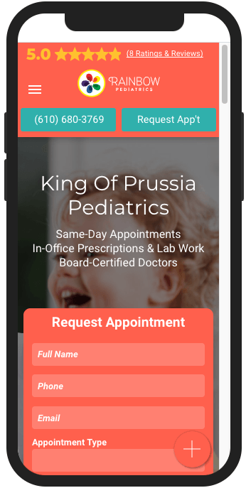
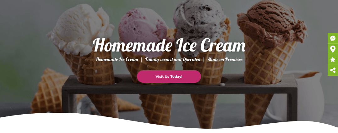
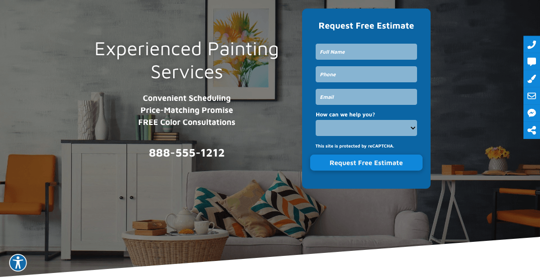
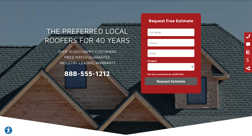
Superhero Section
A superhero is one section with two unique rows.
- Top Row - features a headline, motivating factors CTA(s), and the (optional) open / closed Hours inside a single column.
- Bottom Row - is a two column row with a headline, motivating factors CTA(s), and (optional) open / closed hours display in left column and a form on the right.
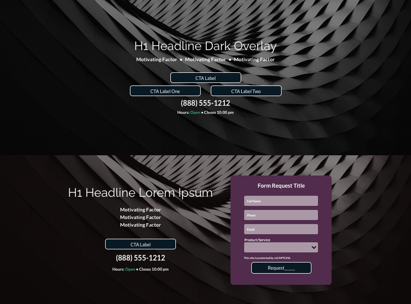
Top Row
Bottom Row
If on the questionnaire:
- Primary or secondary CTA is a form fill, writer deletes the top row.
- Primary or secondary CTA is not a form fill, the writer deletes the bottom row.
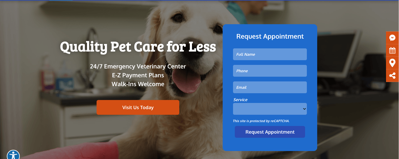
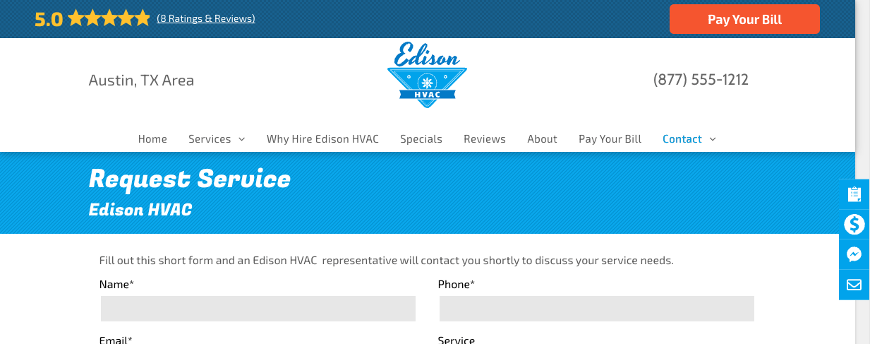
The Superhero Form
The ultimate goal of a website is conversion, and forms play a vital role in doing so. Therefore, the form must be simple to understand and easy to fill in. Or, in short, a form that converts. The superhero form is designed to do just that -- convert a website visitor into a "quick lead" as simply as possible.
The Superhero Form Rules and Guidelines
- The superhero form has four fields: Full Name, Phone, Email, and a product/service dropdown.
- Additional fields are strictly prohibited.
- We can always add additional fields to the official dedicated Request Form made available to the user in the desktop and mobile header, engagement menu, callouts, and throughout the run of site copy.
- If requested, Copywriter can remove the dropdown or swap it out with another text field (except the Long text /Message field, this field increases spam emails to customer)
- Copywriter will update:
- The "Form Request Title headline". The headline displays on a single line.
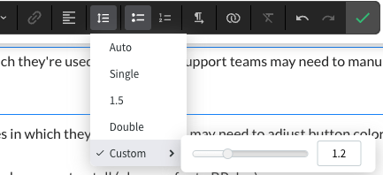
- Build Given the limited number of characters, expanding the name with additional words (Get Free Estimate Today) may cause the form title to wrap to the second line. If text wrap is unavoidable, reduce line height to 1.2 in the text editor and ensure text is centered and spaced correctly on mobile. Additionally, the artist may need to reduce the mobile text size.
- The Submit (Request_____) button. The button text should compliment the Form Request Title headline.
- Product/Service label accordingly. If applicable, team may substitute Service or Product with something more specific to business and request like "Case Type" or "Project."
- Product/Service dropdown options to mirror global nav labels. For example, if navigation displays (from left to right) HVAC, Heating, Plumbing, Septic then the dropdown will display (from top) HVAC, Heating, Plumbing, Septic.
- By default, the form dropdown will include and display "Other" as last option.
- Sender name (NOB) located in Submission recipients
- Form Email address (Submission recipients)
- Design updates superhero form fonts type and color, form background and color to match website color palette and design.
- Verify the text is aligned, if not update spacing and possibly font size if needed.
- Copywriter / Build will not update:
- reCAPTCHA style. Leave as is.
- Submission Actions (Thank you message). Leave as it.
- By default the Thank you message will display as white text. Build will update font color if form background color makes reading message difficult to read.
- Leave Form Title (not to be confused with "Form Request Title headline") as is.
- The form may not be swapped with text featured in left column
- Do not increase or decrease superhero form width.
- Do not add free text or introduction text
- Do not add logo(s) to the form.
- MUST BE added to all pages that matter unless specifically asked not include on every page.
Form Request Title
Hero Request Form
Superhero Background Image
When the superhero row includes a form, assume the text (headline, motivating factors, CTA, etc.) on the left and the form on the right will obstruct most of the background image and focal point.
A focal point is the part of an image
(or text)
that draws the eye of a viewer to the most important part of the image or the area that you want to highlight.
Build should flip a stock image or nondescript client provided image using HWP image editing tool to highlight focal point.
Before background image flip
After background image flip
Background Image Flip Considerations
- Do not flip any image that contains text like truck, store front, money, names on lab coats, signage, etc
- Only flip nondescript client provided images such as those featuring homes, lawns, food, and the like.
- Do not feature a flipped image in a hero and the original version of the image somewhere else on the same page. The original may be displayed elsewhere on another page
- Build does not need to amend name of flipped image provided the original uploaded image was correctly renamed per
guidelines.
Motivating Factor Widget
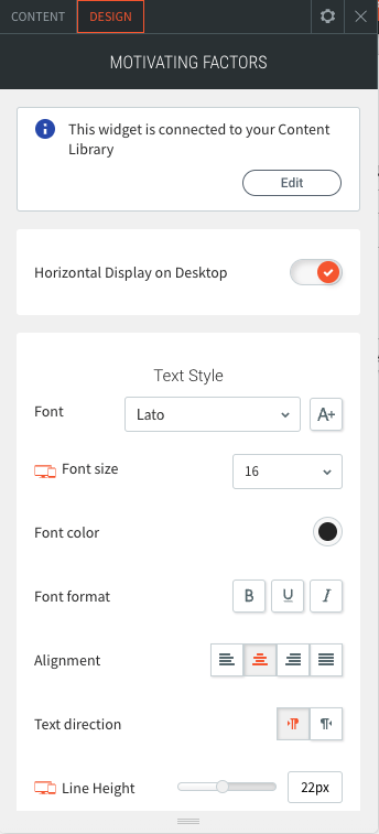
- The motivating factors, as displayed in the desktop and mobile superhero are populated via the Motivating Factors widget.
- By default the Motivating Factors widget is connected to the Content Library (Business Text) "Motivating Factors Widget" field. This singular field populates both desktop and mobile, thus eliminating the need to enter and manage motivating factors in two places.
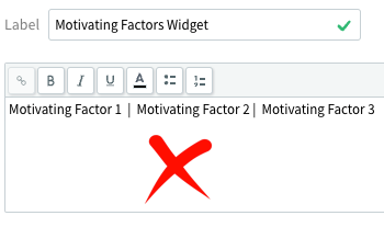
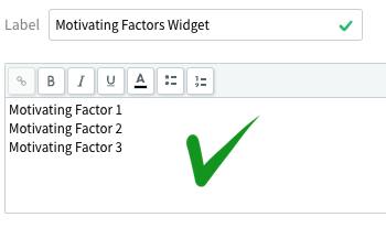
- Copywriter must enter or update the client's motivating factors into the Motivating Factors Widget field as a vertical list, not horizontally.
- By default, the superhero displays desktop motivating factors horizontally when the form is not displayed. Mobile motivating factors are displayed vertically.
- By default, the superhero displays desktop motivating factors vertically when the form is displayed. Mobile motivating factors are displayed vertically.
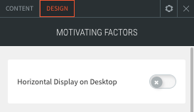
- Note: The Horizontal Display on Desktop toggle -- located at the top of widget -- will force the motivating factors to display horizontally on desktop.
- Similar to the Callout, Coupon, and Copy Block widgets, Build edits the motivating factors text style and spacing through the widget and not the text editor.
- Note: The motivating Factors Widget provides an option to change the divider (•, -, /, ) that separates the horizontally displayed motivating factors. Build may update divider style and color as they see fit, provided the same divider style is used throughout site.
- Note: Given the width of the desktop box overlay, the horizontally displayed motivating factors may wrap into a second line. If this occurs, Build should either reduce the font size, or toggle off the Horizontal Display to display motivating factors vertically.
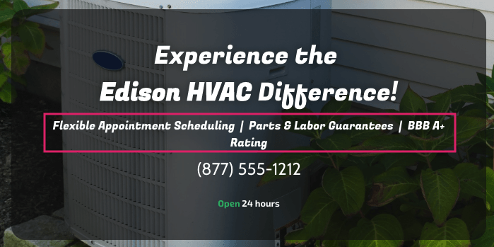

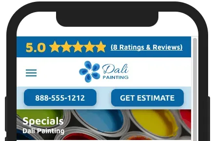
Superhero Calls to Action
- When featuring a superhero Section without a form (Top Row), Copy/Build will follow our standard CTA process.
- When the superhero features a form, the Hero may display any one of the following:
- a Visit Us button
- a phone number
- a Visit Us Button
and phone number.
- Note: Since the superhero has a form, there's no need to include a Request _____ button.
- Request _____ in desktop and mobile header displayed per our standard CTA process.
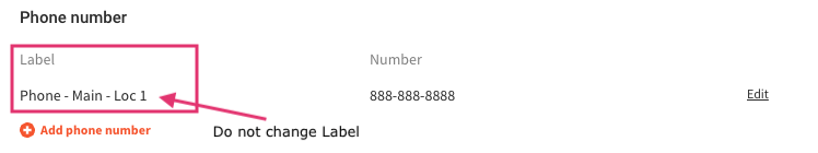
- Note: The phone button is, by default, connected to Content-->Business Info-->Phone - Main - Loc 1 (label)
- If the Phone - Main - Loc 1
label is altered the connected phone will not display.
General Considerations
- H1s are designed to inherit the global styles defined by the sites in which they're used. Build may need to manually adjust the font size and/or color to reach the desired look and feel.
- Adjust line height to 1.2 when the H1 wraps to 2 or more lines
- Note: The artist is also the typesetter, so they're responsible not only for how the type looks, but for making it as readable, logical, and clear as possible. The line breaks of a headline have a major impact on this.
- When the H1 (or any headline) is more than one line long, it will break. If you leave these line breaks up to HWP, you often get text that doesn’t read well or look as good as it could. Build must review all page hero H1s and make manual breaks for both sense and balance.
- Breaking for sense means reading the copy and making line breaks where you might logically pause when reading it aloud. When breaking for sense, strive to:
- Keep important phrases together
- Line break after punctuation
- Pair adjectives with their nouns
- Keep proper names / NOB together
- Keep City, ST together
- Note: Centered headlines should go with centered text. Left aligned headlines should go with left aligned text. Avoid mixing the two together so that your text doesn't look unbalanced.
- Buttons are also designed to inherit the global style defined by the sites in which they’re used. Build may need to adjust button color to ensure proper contrast against the image being used.
- Build should reduce top/bottom padding if the text used makes the hero row too tall.
- Be sure to always test / view on mobile, as the mobile settings are different than those for desktop/tablet.
Superhero Design Options
There are four superhero sections:
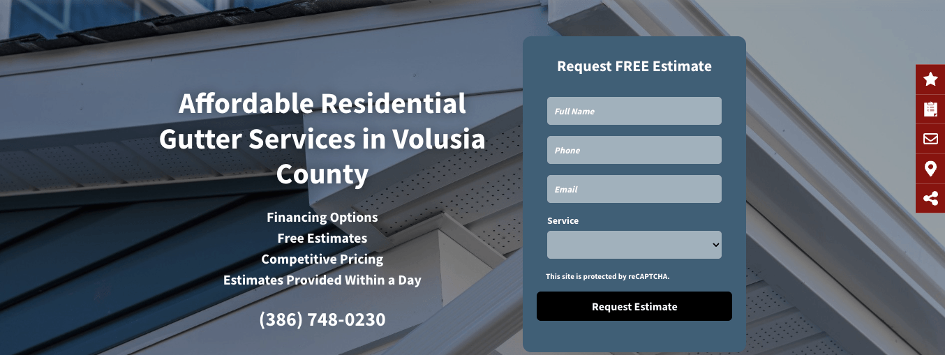
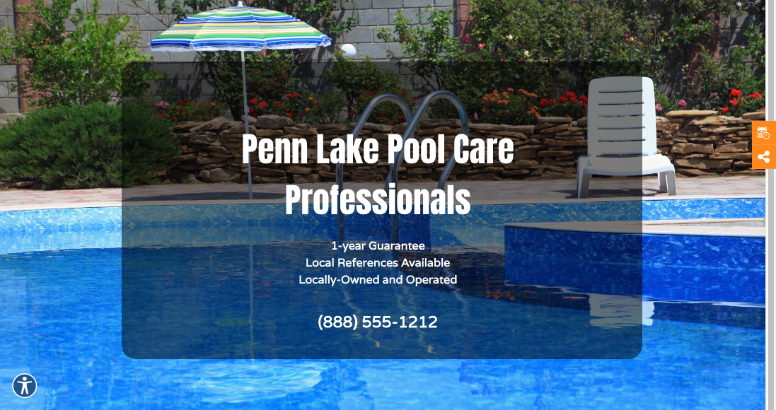
Standard Superhero Section
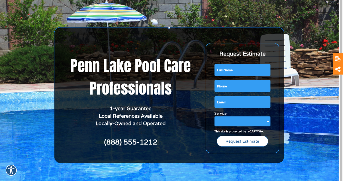
The Standard superhero incorporates a full-bleed row dark (#000000) background overlay. Depending on the background image and font color, the Build can adjust overlay color to make text readable. When incorporating a light (white) or dark (black) overlay color, the best range is typically between 30% and 70% -- which will vary slightly based on the featured background image. Remember, the key here is readability.
Note: By default the H1 headline includes text shadowing. Rule of thumb is to turn off or minimize text blur if you can see shadow effect behind the letters.
Standard without form
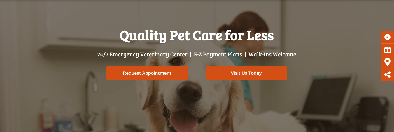
Example 1 - Standard with form
Mobile Standard without form
Mobile Standard with form
Box Overlay Superhero Section
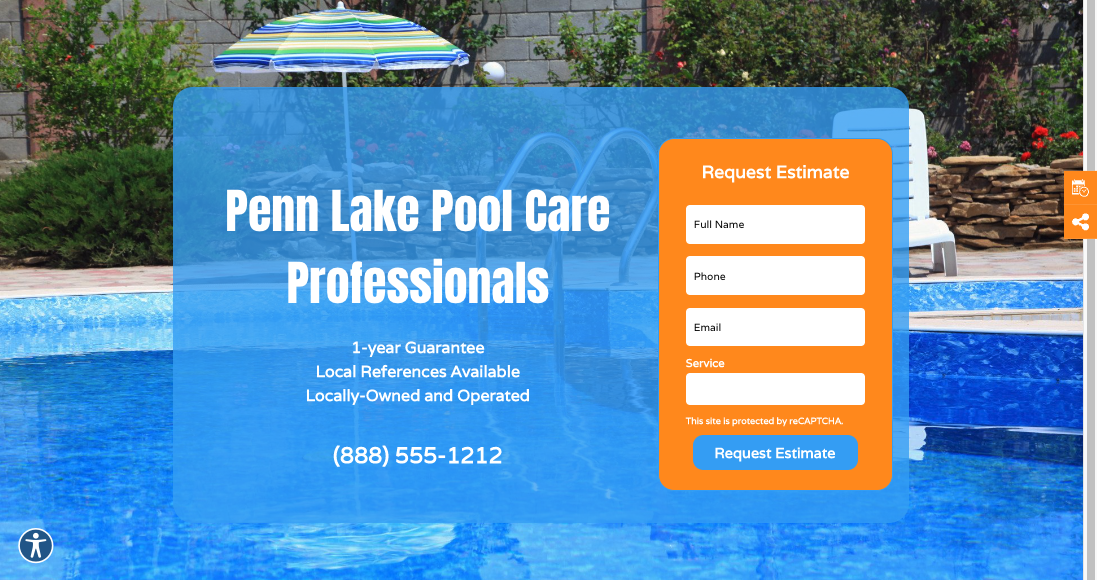
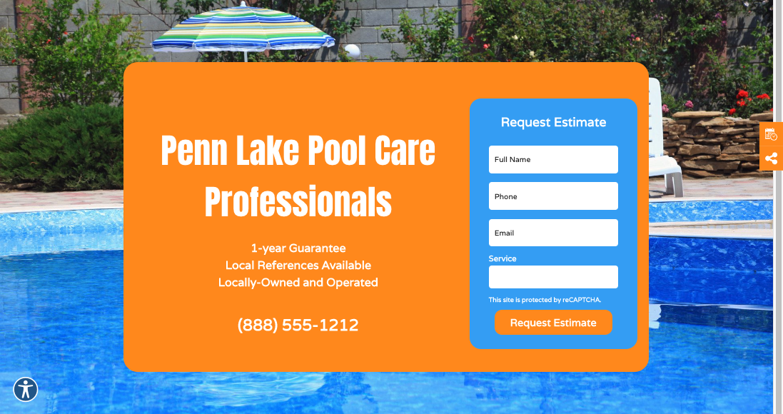
The Box Overlay superhero features an overlay in the box behind the text (and form) but not on the full-bleed background image. Depending on the background image and font color, the Build can adjust overlay color to make text readable. When incorporating a light (white) or dark (black) overlay color, the best range is typically between 30% and 100% -- which will vary slightly based on the featured background image. Remember, the key here is readability.
Unlike the Standard superhero overlay, which is typically a dark (#000000) or light (#FFFFFF) color opacity, the Box Overlay may be a site palette color. The form can be the same color at the overlay provided a border and other, and other site/complimentary colors included to let the user know they're looking at a form.
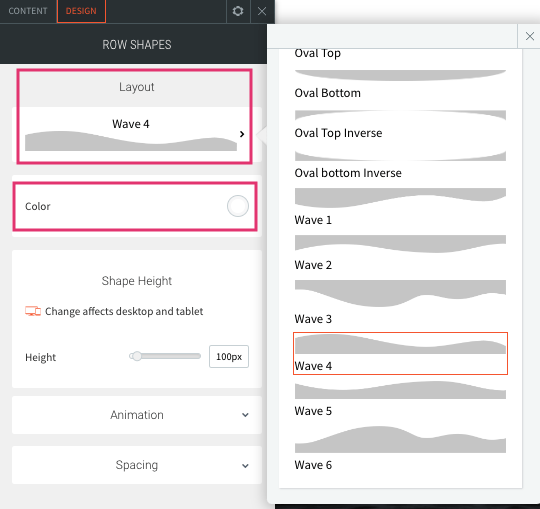
Row Shapes Superhero Section
The Row Shapes superhero is the same as the Standard superhero, but also includes our Row Shapes widget, which offers a variety of shapes (angles, waves, etc.) that can be applied to the bottom of the hero image.
The default section shape (Layout) is Wave 4. Design may switch the shape to any one of the following options:
- Angle 1
- Angle 3
- Chevron Down Inverse
- Chevron Up
- Chevron Top
- Oval Bottom Inverse
- Wave 4 (default)
- Wave 5
- Wave 6
Design will have to update Color to match global page background.
Transparent Header Superhero Section
The Transparent Header superhero is a design option in which the logo, navigation, and other header elements are overlaid on top of a large hero image, resulting in a sleek, modern look. Review Transparent Headers training for detailed build instructions.
The Transparent Header superhero design will be present only on the homepage. It is the discretion of Copywriter which superhero (Standard, Box Overlay, Row Shapes) is displayed on the internal pages. As a general rule, keep the hero style consistent across internal pages; do not mix and match across different pages.
If Build chooses to update the internal pages with a different hero, it is acceptable.
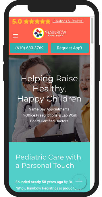
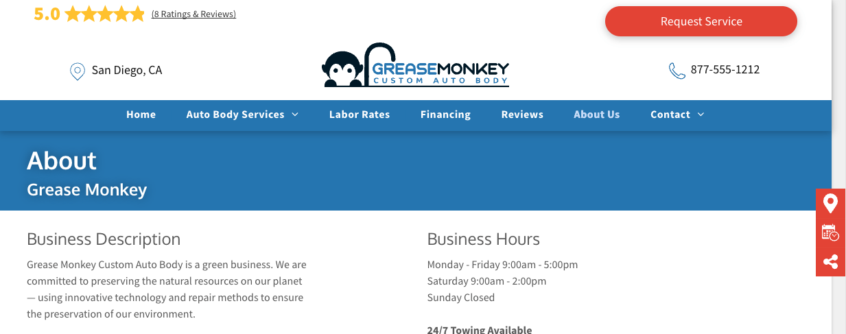
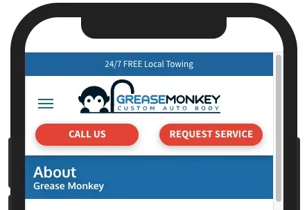
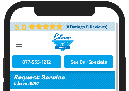
Thin Hero
Hibu
Thin Heroes
There are two types of webpages:
Utility Pages are very specific to a task. Examples include About, Review, Gallery, Request Appointment, About, etc.
- Ideally, we want the user to get the information as quickly as possible because they’re on that page for a very specific reason — and, most likely, they are “sold” (or close to being sold) on the product.
- The utility page will be a page a visitor looks at after they have seen “Core Pages.”
- The hero only needs to tell the user that they’ve arrived via a simple headline: About, Review, Gallery, Request Appointment, About, etc.
- All Utility Pages will feature a thin hero. These pages include:
- About Us - Specific to a company (default Smart Site About Us page)*
- About ______________ - Specific to an individual (i.e. bio page)
- Blog*
- Calendar
- Careers / Job Postings
- Contact Us*
- Coupons / Specials, Discounts / Offers, Rebates etc. (if no Assistant Banner requested)
- eCommerce / Online Store
- FAQ / Frequently Asked Questions*
- Finance
- Gallery*
- Meet Our (or Your) Team, Technicians, Trainers, Attorneys, etc
- Patient Forms / Resources
- Request __________________ Form*
- Reviews*
* Thin hero included with CL Template
- Core Pages include:
- Home
- Product / Service Page(s)
- Menu (one menu)
- Menu (multiple / specific)
- Coupons / Offers and the like (if Assistant Banner is requested)
- Search / Social Specific Landing Pages
- Exception
- Coupons / Specials, Discounts / Offers, Rebates etc.
- If the site has an Assistant Banner the page will have a Hero
- If the site does not have an Assistant Banner, the page will have a Thin Hero
Thin Hero
Hibu
Thin Hero - Headline (Page Name )
- The thin hero displays the page name and NOB against solid color, gradient, textured background, or nondescript image background.
- The thin hero does not display motivating factors, a CTA, open /close hours, or a form.
- The thin hero headline and NOB should always be left aligned.
- Note:
The H1 "text shadow" is turned on, by default. Text shadow (or drop shadow) is added to distinguish the text from any colored, textured, gradient, or image background it may be in front of. Text shadow is supposed a subtle effect; toggle text shadow off when text shadow is visible.
Solid Background Thin Hero
- A basic solid background is the simplest design option for a thin hero. The color should be part of the site's overall color palette, but not the same exact color as the nav bar above it. If the color palette is extremely limited, a variation of the nav bar color may be used (slightly darker or lighter).
Texture Background Thin Hero
- This design option follows the same considerations as the solid background above, but applies a subtle texture as well.
- Use only Light Diagonal Stripe, Mesh Cane Texture or Rounds and Dots Texture.
- The tile option of the texture must be set on both the desktop and mobile.
Gradient Background Thin Hero
- If a color gradient is being used as a design element in other areas of the site, the same gradient can be applied here as well.
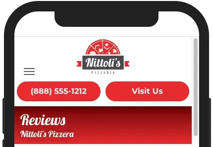
Image Background Thin Hero
- A more advanced design option for the thin hero is to use a background image. The image needs to be nondescript and/or abstract (but still relevant to the business vertical), and should never include people / faces. This can make image selection quite tricky, so this option should only be considered when relevant image concepts are available.
- The same image will be used on all thin heroes throughout the site.
- By default, the website template includes the Thin hero the following utility pages:
- Blog
- Contact
- FAQ
- Location
- Gallery
- Reviews
- When adding a utility page that's not included with the base template, Copywriter/Build may either copy/paste a thin hero from an already existing utility page OR add a section (Sections-->Hero - Super-->Thin Hero)
- Note: In the mobile thin hero, the page name stacks on top of the NOB. The writer must add page name to the desktop and mobile
- The writer will update the Page Name
- Generally, the Page Name will match out-of-norm title tags
- FAQ | NOB
- Testimonials | NOB
- Blog | NOB
- Reviews | NOB
- Etc.
- The NOB is, by default, connected to Content-->Business Info-->Business name.
- If NOB is so long it wraps to second line, disconnect from the Content Library and replace with the abbreviated NOB (if provided).